Showing posts with label Stripes. Show all posts

Friday, 15 June 2012

Gift Wrap - Bright Applique´


A visit to friend called for a little offering, and gave me an excuse, as if I needed one, to have some fun with gift wrapping.  I was tempted by the pretty packaging of this fudge by lovely sweetie brand Burnt Sugar. I'm hoping I get to sample this sea salt caramel variety later as it sounds yummy!

Being the lame-o slightly colour obsessive stylist that I am, I can't resist matching the wrapping to the gift - I just think it makes it more pretty when you unwrap the gift, if everything is co-ordinated (and yes my wardrobe is colour co-ordinated and I have been known to organise my bookshelves by colour too!)


I picked out a few bright greens and pinks, loved the spots and the striped sweet shop bags, but also loving this zany floral print wrap I picked up from a trip to Henley recently.


I wrapped the box in a bright jade green, as a base colour, and then had a look at what worked best with it for decoration. I liked the idea of using both the spots and the stripes to create a band of contrasting colour - but it didn't quite work because of the shape of the box. I would have been left with a lot of green on the top half, which looked too strong. 


Plan B then. Inspired by the bright floral wrapping paper, I decided to cut out individual flowers and create an applique´ design on the front of the box. This is a little gift wrap idea I've used for years and makes an expensive wrapping paper go much further. After a little play, I glued them in place with a glue stick, which is great because you can move the pieces around a bit before the glue sets, without making a mess of the paper.
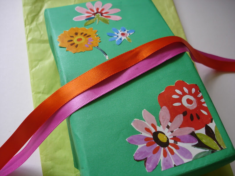


Then, all that was needed was some cheerful ribbons to tie around the middle of the box to finish it off. I doubled on satin ribbon in clashing hot pink and orange combination. Rather than a traditional bow, I tied knot upon knot and used the ends splayed out instead of loops. Sweet.

Wednesday, 13 June 2012

Colour Inspiration - Peach, Coral and Gold


I'm really loving peaches at the moment, the colour not the fruit (I prefer nectarines) and I've been thinking about how to put them together with other colours. 

As a florist, and stylist I get excited by colour all the time as I go about my daily life and so I thought I'd share a colour inspiration with you. Today I took my cue from my jewellery box, some habadashery bits and some new stationery and threw together some pretty pics. 


Here are my top tips for using peach: 


  • Turn up the volume a little and be inspired by India with vibrant corals and jade greens. 

  • Pair peachy pinks with aqua and turquoise greens, and gold.

  • Add warmth with a little earthy brown, and muted champagnes.

  • Add interest to a simple palette with modern graphic patterns - like spots, stripes or chevrons


This could be the first of a new series on colour. I will look more at flowers, obviously as thats my thing, but wanted to show how if you're thinking about colours for outfits, decor or flowers and how to put them together, if you keep your eyes open you're bound to find inspiration is all around.

Monday, 21 May 2012

Simple Vases - Spots and stripes


Just a quick post today - some pretty inspiration for customising old vases, or giving new vases a personal touch.

Washi tape has been massive with crafters everywhere for a while now. Its fab for scrapbook and paper projects but now its time for vases to get the sticky treatment too.


There are loads of different colour-ways and designs out there, so its a great way to tie in a tricky colour, or introduce a little pattern to a tablescape.  Papermash has a good selection, as do Present and Correct, and Jo & Flo on Etsy.

Check em out, but beware, you might just end up wanting them all.


Images sweet paulelle interiorkoyal wholesale

Wednesday, 8 June 2011

Red, white and blue

As a stylist, I appreciate good design in all its forms and am lucky to be able to try out different styles in my work and home.  

Ultimately, for me a home should be a place to take refuge, to relax, and recharge.  I look for warmth, and simplicity in objects, and if I have a constant I would say its a fondness for natural materials, whether that's a beautiful grained wood, slubby linens, natural hues... oh and stripes, because there's something just so clean and classic about stripes especially in fresh blue and white.


So you can imagine, I was in my element on this shoot with Hannah Deacon for Ideal Homes.  I was so busy I barely got to sneak a few shots, but loved the linen and stripes so much I couldn't resist grabbing these.  Beautiful glossy ceramics too. You can see the rest of the shoot in July's issue of Ideal Home, out now.

Friday, 18 March 2011

Bright and breezy

I'm so glad the mornings are getting lighter. Its wonderful to wake up to bright sunny rays streaming through the windows. Have decided I am definitely not a winter person.

You couldn't fail to wake up in a good mood with this perky decor though, shot with Katrin Cargill for Homes and Gardens last year. The stripey papered ceiling and bed canopies give a real quirky spin to classic reds and whites.


Friday, 18 June 2010

Stars and Stripes

Its been a really busy week for me, hence the lack of posting. Saturday I got a call asking if I could assist on a shoot for the magazine Homes and Gardens with none other than Katrin Cargill, one of the very best Interior stylist's on the English Interiors publishing circuit and a star amongst stylists. Of course, I jiggled my work load and said yes I would absolutely LOVE to help. What an opportunity.
The shoot was taking place at a location house near Waterloo over 3 days and the theme was Stripes. Katrin had come up with 3 very different room sets, all of which would have 3 shots - an opener, a double page spread and a detail shot. I can't give too much away, as the photos are under wraps until October's Issue comes out, but the mix of wall coverings, fabrics, and furnishings was fabulous.

On the ground floor we set up quite a smart casual dining room scene, with plush haberdashery used in novel ways to create stripes on a fairly neutral backdrop; the sitting room was elegantly styled in subtle stripes and soft tranquil shades and felt really light and airy; and the bedroom was bold in contrast and stripe-tacular. The theme was carried through to the max, and the shot felt young, modern and playful.

I really enjoyed the shoot. They are always hard work - running up and down stairs, fetching, carrying, unpacking, ironing, repacking, bubble wrapping, labelling - and require amazing feats of organisation to get everything ready to shoot. Although they can be stressful at times, there is a great sense of camaraderie as everyone is working together to get the job done.


One of the things I enjoy most is unwrapping all the packages. Its so exciting seeing what goodies the Stylist has called in for the shoot, sometimes it feels like Christmas! Its great learning about new designers and artists too and seeing how the pieces all fit together. You can really learn a lot from working with someone like Katrin Cargill who has years of experience of Interior Design, putting together and styling room sets for editorial and advertising shoots and has written tons of books on soft furnishings.

At the end of the shoot, I am shattered but looking forward to seeing the photos in print and looking forward to the next one.

LinkWithin

Related Posts Plugin for WordPress, Blogger...