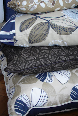
This week I've been over in Suffolk working on a shoot with stylist Abi Bourra and Photographer Sean Myers for The Linen Works. The Location was utterly charming, full of cute nooks and crannies. As well as the main house there were lots of little outhouses to explore. See more pics of this and other location houses here: Oak Management. When the work was all over I could have happily stayed put.
Thursday, 21 October 2010
Thursday, 14 October 2010
Vintage Finds
Modern Mid Century
Ok not strictly speaking Norwegian but there was definitely a woody theme and more than a whiff of Scandinavian mid century modern on this shoot styled by Sarita Sharma for Ideal Home's february issue.
Ho Ho Ho - Christmas Decorating
Just a few piccies from behind the scenes on a shoot for BBC Homes & Antiques with Kiera Buckley Jones. Feeling festive already.
Monday, 11 October 2010
Away days
Tuesday, 28 September 2010
You Magazine - New Trends in Lighting
Did a shoot with Abi Boura the other week in an old Victorian school. The building was great very rough and industrial in parts. A fantastic backdrop to show off new trends in Lighting for You Magazine.
There were lots of oversized bare bulbs and red flex with a modern utility look.
Metallics - slick, modern, shiny mmm
Caging crops up in lots of new designs too. I liked these lamps they had an interesting structural/sculptural look. But they were a bugger to get a bulb in!
Kelly Hoppen Wallpaper shoot
Back from a long Blogger break. Been rather busy working on lots of Interiors shoots. Below are some snaps from behind the scenes of a shoot with Abi Bourra for a new range of wallpapers designed by Kelly Hoppen for Graham and Brown.
Sunday, 8 August 2010
Little Boy Blue
Box of delights
Finally got round to painting the little dolls wardrobe that my grandad made me. Its been packed away in a cupboard for years, so its nice to get it out and make use of it. I decided to go for soft grey/white by Farrow and Ball called Cornforth White. Its kinda roughly done - my painter and decorator chum Dow would not be impressed, but luckily I like the shabby look (good thing too!)
A dinky wardrobe full of forgotten treasures and pretty gems xx
Monday, 2 August 2010
The Dormy House Shoot
A few weeks ago I was invited along to help out on a shoot for The Dormy House with Katie Sellers (check out her website for some truly inspiring images) The shoot was at a location house in New Cross, which has fabulously high ceilings, sash windows, old radiators and a great staircase all of which make for very photogenic backdrops to any product or editorial shoot.
On this occasion we were going to be working on catalogue shots for The Dormy House, a furniture company run by the lovely Anna Trinder and family. They were looking to update the catalogue, and to get some festive cover shots for the autumn/winter launch.
The floors and walls can be a bit wonky in some of these old location houses but I think it was I who was a tad skewiff in this one! Lovely lamps though.
Pretty little dressing tables. I L.O.V.E the platinum crushed velvet stool, after all velvet is the touchy feely fabric de jour don't you know?! There is something so pretty about these soft greys, silvers and winter whites, they gave the finished shot the feel of a crisp winters morning.
Deliberating over how best to shoot the study desk and chair combo. You would not believe the infinite number of variations we tried for this shot, but we got there in the end!
Many of The Dormy House products are available in different colours and paint finishes. I'm loving the new French Grey and Katie's printed luggage tags.
Katie admitted to having a bit of a thing for birds, and claimed to have them all over her home in different forms. I fell for this sweet bird print by Karin Akesson available from www.alittlebitofart.co.uk
Sunday, 1 August 2010
Blendworth Fabric Shoot
Mid July I was working on a shoot for Blendworth who are launching a new line of fabrics designed with Steve Dobinson and wanted shots for their pattern books, and press images. Interiors stylist Cat Huckerby asked me along to help out.
Cat used a variety of understated tones and textures as a subtle complement to the fabrics.
Here we had just shot a story using fabric attached to the wall with Gutter tape (the panacea of almost every conceivable styling conundrum - Gutter tape works wonders) I liked the simplicity of the shot after most of the props had been removed, although admittedly, it wouldn't sell much fabric!
Subscribe to:
Posts (Atom)